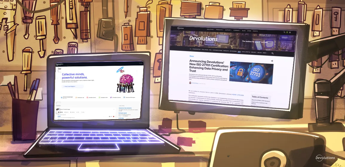
Recently, our VIP user advocate platform Devolutions Force underwent a total overhaul. As we highlighted, the new and improved Devolutions Force is now easier to navigate, faster to use, and features more opportunities to earn points, climb the leaderboard, and earn prizes.
Well, we had such a great time making Devolutions Force better, that we decided to keep going and make some big improvements to the Devolutions forum and blog! Keep reading to see what’s new and exciting.
What’s new in the Devolutions forum
Each month, thousands of IT pros from around the world visit the Devolutions forum to exchange ideas, discuss issues, get solutions and workarounds, and connect with Devolutions experts (including our CEO David who LOVES checking out the forum whenever he can!).
In recent weeks, we have made significant enhancements to the forum. The biggest change is an all-new UI that removes the sidebar, and adds a new main page that offers quick and easy 1-click access to the most popular sections including:
- The sub-forums for our roster of products (e.g., Remote Desktop Manager) and companion tools (e.g., Devolutions Workspace).
- The sub-forums for our new learning hub Devolutions Academy, as well as product documentation, and sales/licensing information.
- Frequently-accessed resources including our Knowledge Base, Technical Support, Online Help, and the Devolutions Blog.
- A continuously updated log of the most recent forum posts.
- An updated messaging feature to contact the Devolutions staff directly.
- Finally, a lot of the actions that were in the sidebar are now in the top bar.
We have also made navigation easier and more intuitive thanks to a more complete breadcrumb, and added indicators that display the selected platform in list threads (e.g., RDM Windows vs. RDM MacOS).
What’s new in the Devolutions blog
We have also made some key improvements to our popular Devolutions blog, which like our forum is visited by thousands of people each month. While many of our visitors are IT pros, we also welcome professionals who hail from marketing, sales, operations, R&D, risk management, and more. There is something for everyone, from product updates and tutorials, to polls and Sysadminotaur!
Our blog re-invention project is ongoing and will continue throughout the remainder of 2024 and into 2025. Here is a summary of the latest enhancements:
- Our various blog categories are now color-coded, which makes navigating and selecting desired content faster and easier (especially for those using smartphones with smaller screens!).
- Visitors who want to see all of the blog entries for a specific category can now simply click the tag for that category. For example, clicking the tag “PRODUCTS” on any blog instantly displays list of all blog entries that are tagged “PRODUCTS.” What’s more, the list is organized in chronological order, starting with the most recent.
- In the past, the clickable table of contents for each blog was part of the summary. Now, we have moved the table of contents to the right side of the display. This makes reading and navigation easier.
- We have tightened up the rules so that the “related posts” that are suggested at the end of each blog are more relevant and recent.
- We have standardized the look and feel of blog posts with respect to image size and placement, text sizing and spacing, etc. The result is a more consistent, predictable, familiar, and engaging experience.
Share your feedback
The enhancements to our forum and blog are designed to deliver a better experience for our community members. Please let us know if we are on the right track by commenting below. Tell us what you like, as well as what you want us to change, remove, fix, or re-invent. We are always listening to you, and rely on your advice to make things better.


