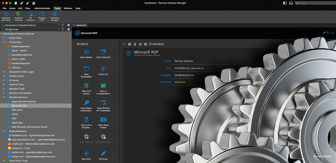
Since you’re an IT pro, you know that user interface isn’t a small detail – it’s a big deal, and it makes or breaks a solution. That’s why we’re obsessive around here about optimizing the RDM user interface and making it work for you instead of against you. We want to make it as functional and versatile for you as possible without clogging or cluttering up your workspace. It’s a constant balancing act!
One of the ways we strike this balance is by offering you 2 user interface options: ***Ribbon ***and Menu.
Ribbon – This is my personal favorite, and also the most popular among our users. Most RDM features are accessible, which makes it efficient and user friendly. We’ll take a closer look at Ribbon in a moment.
Menu – This UI was part of a previous generation, but we wanted to keep it around because we know many of you like it. It has a standard menu for choosing various commands/features.
A Closer Look at Ribbon
Let’s take a closer look at Ribbon’s main screen. As you can see from the screenshot, each section/pane offers different features:
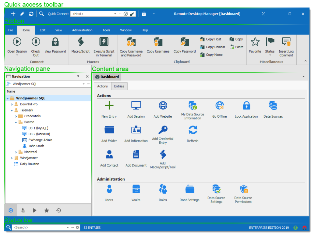
Quick access toolbar – Offers a quick access to some of RDM features such as: the System menu icon, Favorite commands, Quick Connect control and the Lock command.
Navigation Pane – The Navigation Pane is one of the main components of Remote Desktop Manager user interface. It lists all the available entries in the current data source, and allows to switch to another data source or Vault.
Content area– Contains the various dashboards to manage RDM, as well as embedded sessions. There is one single dashboard active at a time, depending on the currently selected node in the Navigation Pane.
Status bar – Contains your search/filter area, RDM version label, the Online/Offline toggle and grab input toggle.
It’s not hard to see why Ribbon is the most popular user interface – everything is nearby.

Customizing Your UI
We’ve also made it easy for you to customize your RDM user interface. For example, let’s say that you launch your sessions in embedded mode, and therefore want your screen to show your dashboard only. No problem! Simply hide your Navigation Pane and Top Pane, and voila, you have much more room. Here’s what it would look like:
Don’t worry: if you get a little bit lost because you’ve hidden features/options and don’t know how to get them back, simply go to Window – Reset Layout to reset the layout to its original view.
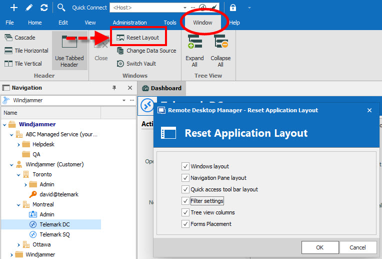
On top of that, our panels can be reorganized and moved as you prefer. When you start dragging you will see a few acceptable drop destinations appear. This isn’t a topic easily covered by a blog post, so we have a video to display that feature in depth. You can find it here.
As always, please let us know your thoughts by using the comment feature of the blog. You can also visit our forums to get help and submit feature requests, you can find them here.

