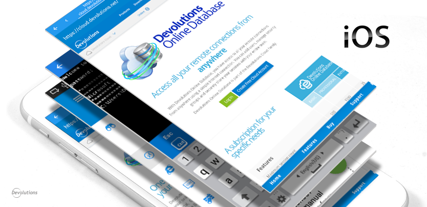
As you hopefully know, we recently launched the new and improved version 2.0 of Remote Desktop Manager for iOS. If you haven’t downloaded it yet, you’ll find it in the App Store.
Exploring the New Multi-Tab Feature
While there are many improvements in RDM for iOS 2.0, one of the biggest is the new multi-tab option. Let’s start by taking a quick look at what inspired this new feature.
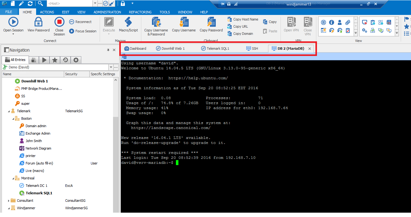
One of the most important aspects of RDM is that it’s easy to use, with intuitive menus, navigation and layout. Here’s a screenshot of the desktop version of RDM so you can see what we mean:
Tablet and Smartphone-Friendly
As you might expect, it was essential for us to reflect this focus on UX and usability in RDM for iOS. There are, however, many different screen sizes and various resolutions to consider. And that’s where the new multi-tab feature comes in.
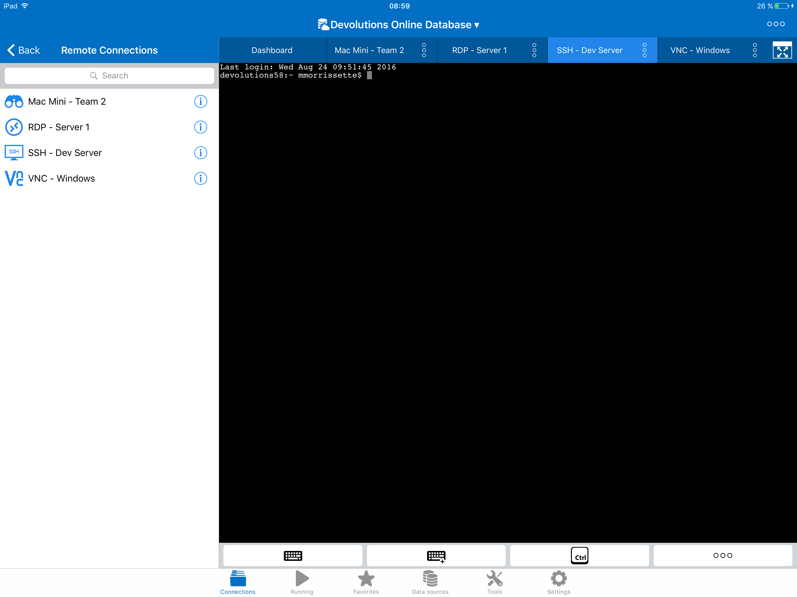
This feature is essentially a sliding tab that sits above an open session – so it’s out of the way, and doesn’t interfere with your work area. To switch between sessions, all you have to do is swipe and click on the one you wish to open. It takes literally a second to switch between sessions.
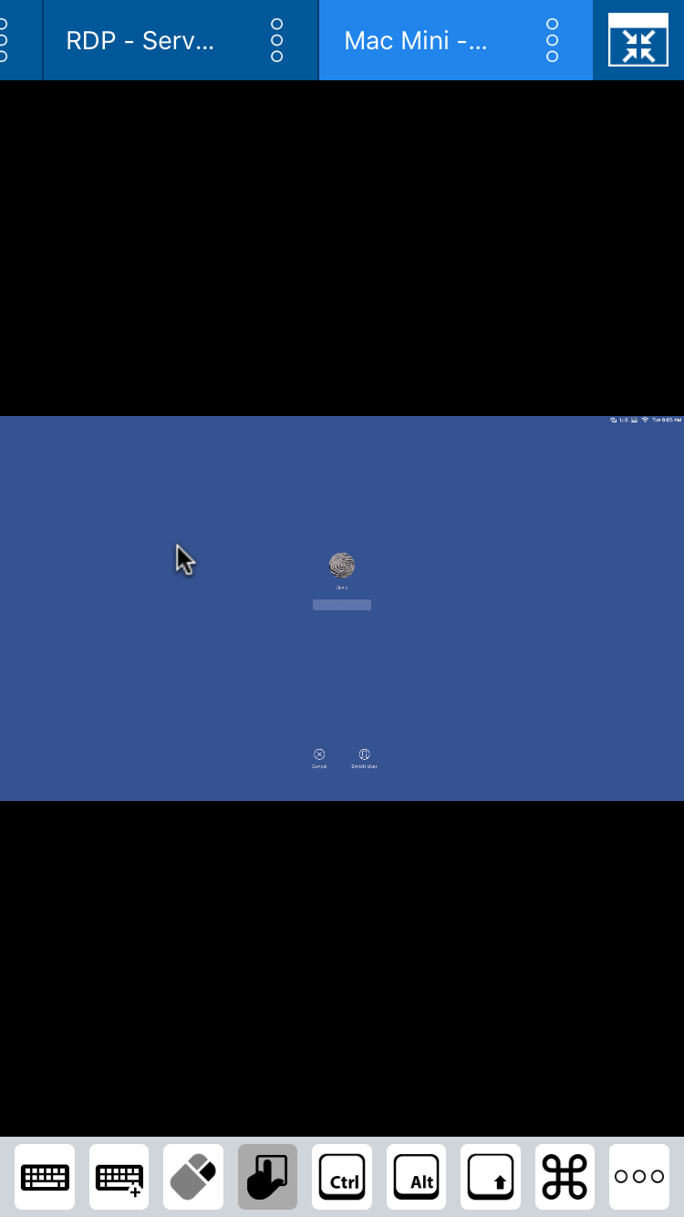
To get a clearer sense of how this feature looks and works, here are two screenshots, one from an iPad running RDM for iOS and one from an iPhone.
As you can see, the iPad version lets you easily access your home menu (on the left) while your sessions are open. To switch between sessions, you simply swipe and click on the session you want to launch on the tab above your work area. If you want to organize your sessions, you can drag and drop sessions on the tab. You can also enable the full-screen mode (so it’s similar to the smartphone version).
On the other hand, on a iPhone. Once you access the home menu and configure your session, you can toggle between full-screen mode and the standard screen mode, using the multi-tab function to switch from one to the other. As with an iPad, you can drag and drop your sessions on the tab. The main difference between the tablet and smartphone interface is that on a tablet, the navigation menu is on the left, while on a smartphone, the menu is hidden while your session(s) is open.
Send Us Your Feedback!
We hope that the new multi-tab feature in RDM for iOS 2.0 helps you save time and simplify your work. We’d love to get your feedback on this or any other aspect of the app. You can comment below, or send me an email at jdupont@devolutions.net and I’ll make sure that your feedback gets straight to our iOS Development Team.

